
Key Considerations for Effective Mobile Design
It’s no secret that digital commerce is shifting to mobile devices. According to Adobe, 54% of 2017 holiday season retail traffic is coming from mobile devices, but these mobile shoppers only accounted for 37% of purchases. More than ever, retailers need to find ways to convert these mobile shoppers, and conversion begins with effective mobile design.
Mobile Users
Effective mobile design converts. To convert visitors, you need to understand why they are on their phones in the first place. Mobile users generally have their phone out to facilitate these three activities:
- Microtasking: Using their device for short bursts of activity
- Local Exploration: Finding out what’s nearby
- Boredom: Using their device for distraction/entertainment/browsing
To drive mobile conversion, you need to build an experience that engages and attracts users in all three groups. Remember these three cohorts: you’ll see them again later.
Where to Begin: 2 Approaches to Mobile Design
So, effective mobile design converts users. How then should you go about approaching a new mobile design? In one of these two ways:
1. Mobile-First Design (Progressive Enhancement)
With mobile-first design, the design process begins with the smallest screen, and then scales designs up to larger viewports. In the mobile-first method, designers are working with the tightest limitations up front. This enables them to make the experience more robust as screen size increases.
2. Responsive Design (Graceful Degradation)
With Responsive Design, the design process begins with a large, common viewport (say, a desktop), and scales back the experience to mobile screen sizes. In this method, designers create the best desktop experience possible and edit or remove content as screen sizes become smaller.
While both approaches can lead to engaging mobile experiences, mobile-first design is the way forward. With more people on their phones than ever, designers need to focus their efforts on creating excellent mobile experiences, not paring away content to fit size constraints. Mobile-first design allows for the creation of engaging mobile experiences – despite screen limitations. When it needs to be ported to desktops, functionality can be added. It’s a win-win.
Think About Thumbs!
The most important user experience tool to design around is the thumb. As touchscreen phones began to dominate, the importance of the thumb and how far it could reach became more important to the experience. Here are some heat maps from Samantha Ingram at Smashing Magazine that show thumb ranges on a typical iPhone.
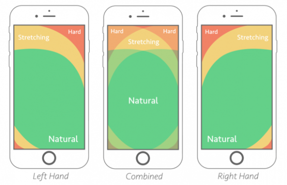
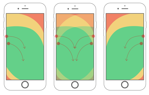
Here’s some facts: 49% of people hold their smartphones with one hand, limiting their reach as seen in the above images. 75% of interactions are thumb-driven, meaning that mobile design needs to be optimized for one-handed thumb-based browsing. Touch targets are usually between 35-45 pixels, but thumbs usually come in around 72 pixels.
Today, as phone screens continue to grow, it is still critical to ensure that touch targets are accessible. More importantly, though, ensuring optimization for intuitive interaction placement and accounting for natural gestures will provide the most mobile design value.
Shoppers On the Go
Mobile users are usually in motion: they have something to do and are using their phones to enable that action, find something close by, or relieve boredom. Mobile design needs to lighten their load and make their lives as easy, fun, and convenient as possible.
With this in mind, here are some ways to optimize mobile designs for people on-the-go:
- Remove unnecessary code and dynamic calls
- Reduce image sizes
- Rethink content organization
- Repurpose native device functions
In addition to ensuring that an experience is engaging even when a user is in motion, we also need to keep in mind other optimizations that further improve a user’s mobile experience, such as:
- Prioritizing key features
- Suppressing low-priority content slots, copy and CTA’s
- Rendering above-the-fold content first (enhancing time to interact)
- Simplifying navigation menus, shortening labels, and trimming copy
- Driving to top-level category pages
- Presenting search field upon tap
- Removing breadcrumbs on mobile
- Implementing larger buttons and click-states for tap interaction
- Using vector-based icons and open fonts.
Unified Commerce
Having a presence on multiple channels is basic table stakes in today’s digital commerce environment. Shoppers want seamless experiences across devices, and mobile design plays a critical role in enabling these journeys.
First and foremost, your design needs to maintain continuity. This means keeping the brand experience consistent as a user moves between touch points and prioritizing user needs based on context across all these channels.
Here’s why this is so important:
- The majority of purchases following a mobile search happen in a physical store (73%) or on the phone (16%)
- 56% of in-store sales involve a digital device
- Web-influenced physical store sales are about 5x that of online sales
- These web-influenced sales ensured sales, stock, and on-order information was consistent and reliable across channels
At the end of the day, these aren’t just “mobile shoppers.” They are customers who perform specific actions on their mobile device and want to be known as individual shoppers regardless of channel. Not only can good design get these shoppers to convert on mobile, but it can drive them into stores and compel them to make larger purchases.
Micro Moments
At last, mobile design is all about delivering what the user needs the moment they need it. Remember, these needs fall into three mindsets: microtasking, local exploration, and boredom. Google calls these “Micro Moments,” and they are the key to creating a seamless experience that engages and delights mobile shoppers.
Mobile Mindsets
Microtasking
Microtaskers use their devices for short bursts of activity. These are people who want to know something or buy something, and they use their phone to enable the completion of that task.
- I-want-to-know
- I-want-to-buy
Local Exploration
These are users that want to do something or buy something and need to know if they can do this nearby. Out comes the phone, and away these users go, plotting their next shopping trip or experience.
- I-want-to-do
- I-want-to-go
Bored
Bored users are, well, bored. They use their device for distraction and entertainment during a commute or a quiet afternoon. These users aren’t directly trying to accomplish a task, but they are ripe to be convinced to learn, shop, buy, go, and do.
Understanding these “micro-moments” is a massive opportunity. There is a need, or an intent, with each mindset. Providing customers with content, design, and messaging that touches on these exact needs is a winning formula. Here are some of the things they are looking to do:
- Compare/check prices
- Look for coupons/discounts
- Read reviews
- Check product details
- Find product availability
- Search store locations and services
- Make a purchase
Well-designed mobile experiences enable visitors to do these things immediately, in context, and enriched with localized and personalized functionality. These experiences are what wins in today’s mobile world.
Interested in learning how to go about implementing these mobile best practices? Download these white papers: How To Build an eCommerce Design Roadmap and Five Questions to Ask Your Future eCommerce Design Partner.