
How It Works: Responsive Design and Media Queries
Do you remember the first time you were able to browse the net on your phone? It was revolutionary. In this age of mobile computing, we have the internet literally in our pockets. What power! It seems that content is able to magically adapt itself to our screens. How is this even possible? Long story short, it all comes down to responsive web design and CSS3 media queries. Short story long, responsive web design allows desktop web pages to be viewed in response to the size of the screen or browser window.
Historically speaking, many sites simply didn’t utilize responsive design. We all recall squinting and zooming in to see a desktop version of a site on our comparatively tiny mobile screens. Miniature links were no match for our clumsy thumbs. How often did you click somewhere well away from where you intended? Ah, the good old days.
Of course, this did not make for a great mobile experience. Reaching into the past, one of the first examples of responsive design came in the year 2001 with Audi.com. Back then, “responsive design” meant that the site’s layout in Internet Explorer could adapt dynamically to the size of the browser window. As far as Netscape went, however, the page would need to be reloaded from the server when resized.
As time went on, improvements to mainstream practice were made. In 2009, CSS3 media queries arrived, allowing for easily accessible responsive capabilities. To this day, these queries remain the most common tool for creating responsive, satisfying mobile experiences.
Let’s take a look at an example of a media query:
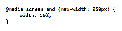
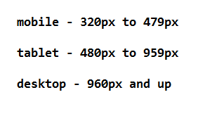
This basically means that if the screen size is less than 960 pixels wide, then the styling gets applied. Otherwise, it does not. It’s as simple as that. By using media queries like this, developers can control what is displayed on different devices. In this example, the styling for less than 960 pixels wide likely means that the page is intended for mobile and tablet devices only, as opposed to desktop. Now, extend this idea to 3 or 4 breakpoints, and you are looking at the number of modern screen sizes that need to be accounted for. Here’s a breakdown of some common dimension ranges.
In this day and age, it is easy to see why responsive web design is considered a necessity. More people use their smartphones and devices for more things than ever before. It’s the first place we turn when researching, well, anything we want to do or buy. As far as implementation goes, tools such as media queries are a simple and effective approach to mobile responsive design.
For over a decade, responsive design has been ubiquitous – which is crazy, considering the pace at which the eCommerce and web development industries adopt new methods and technologies. It’ll be interesting to see where this technology goes next.
Make sure to check in later this week as I expound upon the functionality, benefits, and application best practices of cache.